MealPal is a lunch and dinner subscription service where you receive a set number of meals for pickup over a 30-day period. Depending on your plan you can eat for as little as $6 per meal in New York City, which is quite a feat. I’m now on my second cycle and I’m not planning to leave anytime soon!
Annoying -> Fun
MealPal’s strength is turning something annoying (lunch, yes, extremely first-world problem) into something, well, fun! We’ve all been there – ‘time for lunch…but what should i eat today?! had Mexican last night don’t want it today…that place is too far..only have 30 minutes!’ With MealPal you get an email at 5pm every day telling you that the Kitchen is open for lunch the next day. You then pick what you want when you want it and you’re all set! So now you’ve solved lunch ahead of time and you have something to look forward to. The pick-up is the other annoyance in the lunch process, but MealPal even makes this delightful. Your order is ready when you arrive – no lines, no paying for anything – just show them your order number and you’re done!
Building Anticipation with Online x Offline
I really love the ~18 hours to payoff as it’s unique among digital experiences. We’re accustomed to instant gratification with social networks and news services, but the payoff only requires us to tap an icon on our home screens. There is an inherent anticipation build-up with Food Delivery services, but if it comes on time I’m simply satisfied and if it’s late I’m extremely hangry and nobody wins. MealPal promises me a trip out of the office at a specific time with little effort to accomplish my task of getting lunch – that is something I can look forward to with every meal from them.
After Lunch Experience
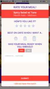
 Another great thing about MealPal is that there’s still more to experience after lunch. The next time I open the App after picking up my Meal I’m immediately prompted for feedback and I love this. It shows me that MealPal cares about my experience and wants to make the product better. The survey is short and to the point and I always complete it.
Suppliers
MealPal has done a great job with the Meal-eater experience, but they have another customer in the Restaurants that supply these meals. I was curious as to what the value proposition (other than exposure and foot-traffic) was to these Restaurants and found this from a great piece by GeekWire:
“MealPal is able to offer lower prices because it gives restaurants large orders for individual dishes in advance. It’s similar to a catering model, which Biggins said is typically the most profitable order for restaurants. MealPal lets many restaurants make more money per meal versus serving individual customers, she said.”
I have no idea what the logistics of working with MealPal are on the supplier end, but this economic arrangement seems very favorable. As good as the Meal-eater experience is, the supply of Restaurants is really the limiting factor to how popular it can become.
Making MealPal even better
While I love the service, there’s always room for improvement. Given how much I’ve used the service and the amount of feedback I’ve provided, MealPal should use those inputs to improve the experience for me. Sarah Tavel of Benchmark Capital calls this Accruing Benefits, which is basically saying “The more I use this product the better it gets.” For example, I’ve noticed that when I go to select my next Meal the options have looked pretty static from week to week, even with consistent usage. This could be because they haven’t added many new restaurants, but my prior activity can used here to give me an illusion of endless choice and keep me subscribed. A couple ideas for this:
- Suggestions – MealPal knows my taste profile, the places I’ve eaten and the places I haven’t tried yet; this would be a perfect opportunity for a suggestion
- Popularity – They also know what’s popular among their customers so this would be a great option for a filter
- 3rd-Party Data – I use other apps and services to find restaurant recommendations and having this layer on top of MealPal would help with discovery. I’d love to see a Foursquare integration (my go-to for reviews/ratings) so I could vet the places I’ve never been to before and maybe see my favorites/history from that service offered as suggestions in MealPal.
To MealPal’s credit I have noticed the addition of filtering by Portion Size, which is something they ask customers to answer in surveys. I find this feature very useful.
Look and Feel
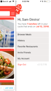
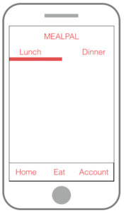
 There are also a few things MealPal could do to improve the navigation of the app. I’m not feeling the hamburger menu and it’s position on the not-so top right still gets buried for me – even as an active user. I’d love to see the items in the hamburger as tabs on the bottom of the screen. If i want to see account settings I have to 1) tap the hamburger 2) tap ‘My Account and then 3) tap hamburger 4) tap ‘Browse Meals’ just to get back to where I was. It’s not hard, but could be so much easier with tabs 🙂
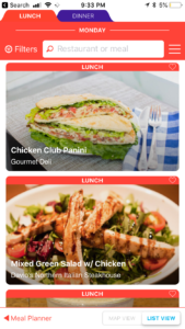
And visually, I really dislike the ‘tabs’ used to distinguish between Lunch  and Dinner on the home screen. They look like browser tabs and to me that just looks wrong on a Mobile App. A segmented control with the ability to swipe between the two sections would look a lot better.
I made a quick wireframe of how the structure of  the app would look with these changes:
Try it for yourself
These minor shortcoming aside, I’m super-excited to see what’s next for MealPal and am very bullish on the service. And if you’re so inclined, sign up for yourself using my invite code: mealpal.com/samgirotra 🙂